Day 2 of #oneweek100people

I have a super busy week and , going in, I did not expect to complete the challenge 100%. I wanted to do the best I can and join in the fun.

Two days in, and I am 13 behind, but that's okay. That's 27 more people I drew than I would have done this week! Some of them I drew in coffee shop, and a the rest I drew from TV.

One Week 100 People 2017 Challenge

Tomorrow is the kickoff day for the first One Week 100 People challenge started by Liz Steel and Marc Taro Holmes

The challenge runs from March 6th to March 10th and the idea is to draw an average of 20 people per day. There is no limit as to what qualifies as a drawing of a person. To starts things on the right foot, Liz Steel just posted this blind continuous line self-portrait that she did. 

Anything goes, as long as it is a drawing of a person!

I am participating and have been doing little super-quick warm up drawings of people around me whenever I get a chance. Here are some portraits I did of fellow-gamers at our weekly game night.

I will share my daily drawings here and on my instagram. Join us, it will be great fun (and a lot of much needed practice too!)

Orange rose

I am enjoying doing these videos. I paint for ten minutes, edit the video for an hour and then all the uploads and everything take another hour. It is time-consuming but a fun new thing that I am learning to do, which is good. I am still trying to figure out things like lighting, GoPro settings and editing the video. It will take a while for me to figure it all out, but in the meantime I better figure out how I should store the gigs and gigs of data this video-making is producing :-)

Today's painting is a quick floral study. I like doing these because they lend themselves beautifully to watercolor, the organic shapes provide a wonderful opportunity to practice brush work, incorporate hard and soft edges, and play with color. I hope you enjoy this video.


Barns on a bright sunny day

I enjoyed the video-making yesterday and wanted to see if I can do any better on timing today. And I did! Practice does make things better. It helped that I didn't have to ask internet a zillion questions about how to do simple things in GoPro Studio. 

Today's demo is of barns on a sunny day. I chose the reference from pixabay.com, my trusty source for copyright free high quality photographs.

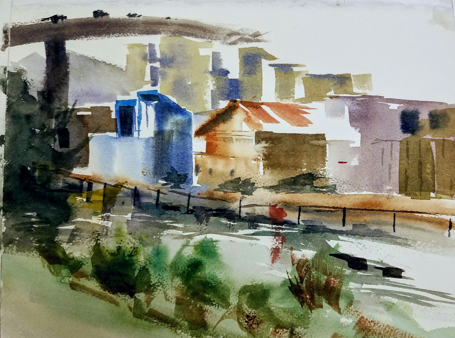
I like this photograph because I could easily break the composition down into a series of shapes, which gave me confidence that this is something I can tackle in 10 minutes (I am making a series of 10 minute paintings for my youtube channel).

In this painting I wanted fewer neutrals and more warm and cool colors so I chose a palette accordingly. The colors I used were :

1. French Ultramarine
2. Carmine
3. Quin Burnt Scarlet
4. Viridian
5. Permanent Orange

The main motivation for this demo is to demonstrate that you don't have to be a slave to your reference. It is your painting, and you are free to choose the colors you want, the composition you want and free to add in elements or leave out some. Do what you want, it is your painting!

As you will see in the demo below, these were the steps I followed :

1) I left the sky white, to reflect the clear bright sunny day. I pushed the coolness of the distant mountains and added interest by using intense purples. In the closer mountains I used a combination of Viridian and purples.

2) I framed the barns with some trees that are closer than the mountains. You see that this is not actually clear in the photograph, but I liked the idea and went for it.

3) Then I mixed a dark shadow color for the sides of the barns, flooding in darker color to indicate some detail. 

4) I used Permanent Orange for the grasses, and made vertical marks with Quin Burnt Scarlet which blended together with Orange and gave the feeling of tall grasses.

5) I mixed a shadow color with French Ultramarine and QBS, and used to paint in the shadows on the ground. I took the shadows further to the left and right than I see in the reference, in order to frame the composition better.

6) The final step is adding some details, just some dark bits here and there to make the picture pop. 

All of this took no more than 10 minutes to do.

I hope you enjoy the video.
 

Swan demo

It has been a terribly busy week, with not much time to paint or sketch let alone play with my new GoPro. Sad, really. Finally I was able to sneak in some painting time, capture it on GoPro and got to play with video editing. It is fun and learning to do some new things, which is always good. I hope that with time things will become streamlined and it will not take as much time and effort to create these videos. 

Here's today's painting and demo video. I used only three colors here - Aureolin, Cerulean chromium and Burnt sienna. 

Happy birthday, SF Sketchers!

Today we had a party at Arch Art Supply Store celebrating the fifth anniversary of the group and the launch of the 10x10 workshop series. We had a sketchcrawl to kick of the day at Mission Bay complex, followed by events at the Arch store with speeches, toasts and while bunch of mingling with fellow sketchers.

What a great day! 

My intention was to capture the painting process on GoPro but I completely forgot about it. It was so exciting meeting everyone that it completely slipped out of my mind.  here are the two sketches I worked on.

Mission Bay waterfront

Mission Bay waterfront

Mission Bay waterfront

Mission Bay waterfront

We only had little over an hour at the sketchcrawl today but I would love to go back there another day and spend the day painting. 

Trying out GoPro

I had a fun lunch break today, with a quick sketch, and a quick capture using a friend's GoPro. I quite like the little device. I am quite new to GoPro and video editing and sharing, and there is a lot to learn here. It is always fun to learn to do something new, isn't it?

Enjoy this quick 10 min sketch from my lunch break.

Michael Reardon Workshop at SCVWS

Last week I was privileged to attend the highly popular watercolor workshop by Michael Reardon. The workshop had filled up in a day, but I got on the waiting list and was lucky enough to finally find a spot at the workshop. This was my very first watercolor class/workshop, so I was quite nervous about it, but just a couple of hours with Michael Reardon put everyone at ease and we were all painting happily along for the next few days.

A bit about the instructor

Michael is a architecture illustrator turned fine artist, who works exclusively in watercolor and has a very distinct style. Check out his website and his book to see his paintings. He paints mostly landscapes, cityscapes and statues in urbanscape, and his style is spontaneous, working wet-in-wet from top to bottom. HIs choice of pigments is unusual, and so is his use of color. He is a self-proclaimed tonalist, and his use of color is as a support to a painting whose composition depends on a backbone of value. And about him as an instructor, if I had only one word to describe him I would say 'kind'. And as a beginner artist, that was important to me.

The unusual palette

DS Ultramarine blue
Holbein Cobalt Blue
DS Cerulean Chromium
DS Cobalt Turquoise
DS Viridian
DS Phthalo Green (Yellow Shade)
DS Quinacridone Burnt Orange
DS Quinacridone Burnt Scarlet
DS Organic Vermillion
DS Carmine
DS Permanent Orange

DS : Daniel Smith

As you can see he doesn't have a yellow in his palette. The closest to yellow in his palette is Permanent Orange. (Actually, I lie. He does have Quin Gold in his palette, but I have not seen him use it in any of the paintings during the workshop). His saying is that yellow almost never exists in its pure form in nature, so he doesn't need it.

One of the paintings that Micheal demo'ed in the workshop

Teachings

There was a ton of good information through out the workshop, and I learned as much from watching Michael help others, as I did from his help on my own paintings. The day always started with a demo, which took anywhere between 1-2 hours depending on the complexity of the painting. Michael had a thumbnail sketch and line drawing ready to go before the day began. 

To him, the most important thing was getting the idea down in a thumbnail sketch. After he has the sketch, he doesn't look at the reference anymore. He works directly from the sketch, working top to bottom (with the watercolor paper at a slight angle, allowing the water to flow down and form a bead), manipulating the bead, taking advantage of it to keep certain areas wet, while he worked on others. He arrives at the values mapped out in the sketch in first pass, and does not go back into painted areas once the area is complete. Someone at the workshop joked that he is like a 'printer'. It is an unusual way to paint, but it keeps the painting spontaneous and fresh, and the simple statement is emphasized. 

He encouraged us to make a thumbnail sketch of our reference, and worked with us to find the most interesting composition. His emphasis throughout the workshop was on composition, and not so much on watercolor technique (transparent vs. opaque, wet-in-wet vs wet on dry etc.), which I appreciated a lot. 

If there were only five things I took away from the workshop, these five would be it :

  1. Framing is important. Just because the quarter sheet is 11x15 doesn't mean you have to use all of it. The 4 walls of the painting are the most important compositional lines in the painting, and use them effectively. A long and tall painting creates drama, vs a square painting is calm. Think about this when you plan the painting.
  2. SImplify the scene into 5-6 shapes. When you do the thumbnail sketch, you should be able to break the scene into 5-6 simple shapes. Make these shapes as interesting as possible, and pay attention to the negative shapes and corners created at the intersection of the shapes with each other or against the edges. If you are not convinced that these shapes work, then move on to another design.
  3. Think about your focal point. Find the most interesting part of your painting, the part where you want the viewer's eye to rest first, and make sure that area is only area where is pure white next to pure black. There can be value changes in other parts of painting, but the focal point is where there should be the most difference in value.
  4. Break the scene into foreground, middle ground and background. A landscape or cityscape has the most clarity when there is a sense of foreground, middle ground and background. Try to find this clarity when you do the thumbnail sketch. 
  5. Make the corners interesting. The corners are as important as the edges. If possible, make all four corners different. 

It was great to have all this drummed into us for 4 days, it meant a ton of practice and clearly some of it got through :-) Here are some of my paintings from the workshop. 

Goodbye 2016, Hello 2017!

Last year was a very good year for me. It was the year when, for the first time, I started identifying as an artist. While I realize that the road is a long one, and it will probably be a really long time before I see results, for the first time I started thinking of things in the long term. 

I usually have goals at the beginning of each year for what I want to accomplish that year and where I want to be end of the year. For the first time in a long time I have no such goals. I am feeling pretty good about how things are going and if I keep working hard at it, I believe that sooner or later everything will come together.

And to get the year started right, here are a couple of paintings I did today. 

California hills in the summertime

California hills in the summertime

Another another one in which I tried a couple of new colors - DS Bordeaux and DS Lunar black.

sunset silhouette

sunset silhouette

With a lot of hope for all the good things yet to come, I wish you all a very happy new year!  

When in doubt paint a sunset

I didn't have any great ideas for what to paint today, so I decided to try a sunset painting. At the very least I figured I will get a chance to practice painting wet in wet, glazing in layers and using some unusual colors. It was all of that and more. I am not unhappy with this painting, especially for a work day :-)

sunset in watercolor

sunset in watercolor

The Sierras

This was the perfect weekend. We didn't have any chores or anything else to worry about, so we spent all weekend at home doing the things we love and watching Star Trek. I enjoyed another day of painting, and today I did a few original pieces. I am trying to get enough paintings done to create a portfolio for my Silicon Valley Open Studios submission. 

The following painting is from a picture I took in the Sierras during our stay there this past Thanksgiving.  I considered the reference in big shapes, made some color swatches before starting work on the final piece and then it was go time.

sierras in watercolor

sierras in watercolor

Let me know how you like it :-)

New media!

I haven't been as regular with my art practice for a couple of weeks because of busy work-weeks but I have managed to keep up with the learning thanks to my online subscription to art websites. The one I have been following lately is Nathan Fowles' Landscape Sketching in Watercolor and Gouache course on schoolism.com. It is a fantastic resource if you want to get to the next level in what makes a good painting. The class covers principles and not so much techniques, and I really appreciate that. I have been doing some composition exercises in black and white for the class and that turned me onto observing and learning from paintings I admire and painting opaquely.

The paintings I did this afternoon are all copies of paintings I admired online. I tried watercolor and Gouache in the pepper painting and I am very happy with the results. I cannot control the medium very well yet but I am happy with how things turned out so far.  

peppers in watercolor and gouache, a copy

peppers in watercolor and gouache, a copy

The next thing I am going to try is painting opaquely in casein. Don't know what that is? Hang on till my next post :-)

Kelly Park Sketch Outing

The South Bay Urban Sketchers met at Kelly Park in San Jose. The whole park is designed to look and feel like what San Jose was like in early 1900s. It is setup with old houses, farm equipment, tolleys, cars etc. and such a joy to visit and sketch. 

I don't have much time to write today but just wanted to write a quick post to share the sketches I did today.

This sketch of an old timey gas stattion didn't look like much until the last 10 minutes. What Joseph Zbukvic says is right after all. You have to keep faith that it will all come together.

I couldn't leave without doing at least one more painting, so I quickly got this one down. Clearly I have a lot more work to do in capturing the sense of light, but this is a start.

I am usually a lot more prolific, but I am noticing that is taking me longer to finish a painting than it used to. However, that could also be because I am able to tackle more and more complex subjects than I ever used to before. For example, earlier I would be happy to paint a single tomato, but now I can paint a whole bunch of them and it is not (too) scary. Growth indeed :-)

It was a good day of painting. Must keep on keeping on. 

Some still life studies today

I am continuing to do well with my "3 paintings a day" project. To be honest, it is not always full paintings per se, sometimes they are as simple as color studies and other times they are studies of paintings I admire. Even so, doing three pages of paintings a day is really helping me make progress and be consistent. 

For today's study I setup a little still life at home, and did a few paintings of the still life. It was a good night of painting.

I really enjoyed this like colorful study. There is not a huge amount of value contrast in this painting, but I didn't mind that. The color hue contrast does the job well of separating the shapes and bringing focus. 

I wanted to do a more careful study of the teal tea pot next, so I setup a still life with just the teapot and I added the orange bud for some interest. Again, I wasn't able to achieve much value contrast, and I didn't wait for the wet areas to dry before going back in there ... but still I like the effects that achieved and how the whole composition looks. 

The next painting I did a bit of an experiment. I discovered Debora Stewart this morning via her Abstract Flowers in Pastel video in artistnetwork.tv. I liked how she played with acrylics and soft pastels to make beautiful abstract florals, and wanted to see how pastels worked with watercolor. This painting looks a little dead in the water, but still I am glad that I tried out this rather crazy experiment. 

Goodnight and see you next time. Meanwhile, happy painting!

Paint out at Ardenwood Historic Park

The Santa Clara Valley Watercolor Society met at Ardenwood Historic Park for the weekend paintsite, and what fun it was! The place had tons of things to sketch and paint - from cows, sheep, goats, rabbits to historic barns and buildings and farms. There is also a fair bit of opportunity to do people sketching, as the place was plenty packed.

I was excited about bales of hay in a barn so I set myself up right in front of it and painted this. I enjoyed trying to capture the backlighting. The design probably needs a good bit of work, but hey one thing at a time :-)

I then turned my attention to the sun beating down on the tin roof of another bark across the park. I liked the lights and darks and deep oranges of the barn, so I just went for it. You can see that the second painting was so much looser than the first one.

The place was actually filled with people and my only regret is that I couldn't get any human figures into the painting. 

Then we relocated to another part if the park with views of the farms. Even though the beautiful perspective lines in the farm was what attracted me to it, I looked around and was even more inspired by this fence.

I am happy with the painting but I wasn't able to reflect the light conditions as well as I wish. The last painting was mostly under an overcast sky and I wish I could have had more cooler colors in there to reflect that.

I also did a few sketches of the farm animals and fellow sketchers in my epsilon sketchbook. 

All in all, it was a great day painting. 

Study : Just a peek by Anne Blair Brown

I noticed this beautiful painting "Just a peek" by Anne Blair Brown in the recent edition of the PleinAir Magazine. I have been teaching myself to paint by studying the paintings the catch my eye, and here is today's study.

I first did a little pen study, looked at the composition and the colors carefully and then proceeded to do a simple "gouache" color study. I don't have a set of gouache paints, but watercolor paints combined with white and black gouache tubes will work just as well.

Then I moved on to a watercolor study. I did one or two laters of watercolor paints, and cleaned it up with gouache. 

I had so much fun with this exercise, and learned so much as well!

Splashing paint

I am continuing my daily art practice and averaging 3 paintings a day. It is becoming easier to do that many paintings/sketches/studies every day, especially when I have help from wonderful online instructors like Andrew Geeson.

I love watching his loose style of painting, and his approach to using fresh bright paint and do any mixing wet-in-wet on the paper. I subscribed to his paid youtube channel and did a few paintings. 

Here are a couple :

And another one :

I also did a few sheets of brush stroke/brush control exercises with my round brush, but you don't need to see those :-) I intend to do the same for all the other brushes I own - the squirrel mop, the flat brush, the dagger brush, the riggers etc. and get a sense of the marks they make and the level of control I have with each of them.

Big shapes

I am trying to make it a daily art habit to make at least three watercolor sketches. I realize that the only way to get better at something is to practice, and the only way to practice effectively is to be consistent with the effort. 

I really enjoy painting light, so I tried to enhance that feeling of light in the pictures I painted. I also tried to see the big shapes, and paint in layers to enhance the feeling of light and shade.

The thing that I do not like about the one below is that it looks very much like an illustration than the real thing. Still, I am reasonably happy with how it turned out I guess. I took Tom Hoffman's advice, did a self-critique and made notes right on the study.

Then I started doing some landscape studies in preparation to the art retreat I will be attending in a few days in the high Sierras! I didn't like the first landscape painting I did, and I was a little disappointed. I didn't much feel like it but I pushed myself to  knock off another quick painting to make my target of three. The funny thing is, the painting I did freely and loosely turned out so much better than the one I planned and overworked :-) I absolutely love the feeling of light and color in this painting of fall colors.