Blog
Hi.
Welcome to my blog.
Tea and Marmalade
and sundry creative explorations
All in
Art
Sep
26
Sep 26
Tom Hoffman Studies!
Srivani Narra Ward
Art
Sep
24
Sep 24
Santana Row
Srivani Narra Ward
Art
Sep
21
Sep 21
"Anything under the Sun
Srivani Narra Ward
Art
Sep
15
Sep 15
Buildings!
Srivani Narra Ward
Art
Sep
11
Sep 11
Practice practice practice
Srivani Narra Ward
Art
Sep
10
Sep 10
More loose florals
Srivani Narra Ward
Art
Sep
10
Sep 10
Picchetti Ranch with South Bay Urban Sketchers
Srivani Narra Ward
Art
Sep
9
Sep 9
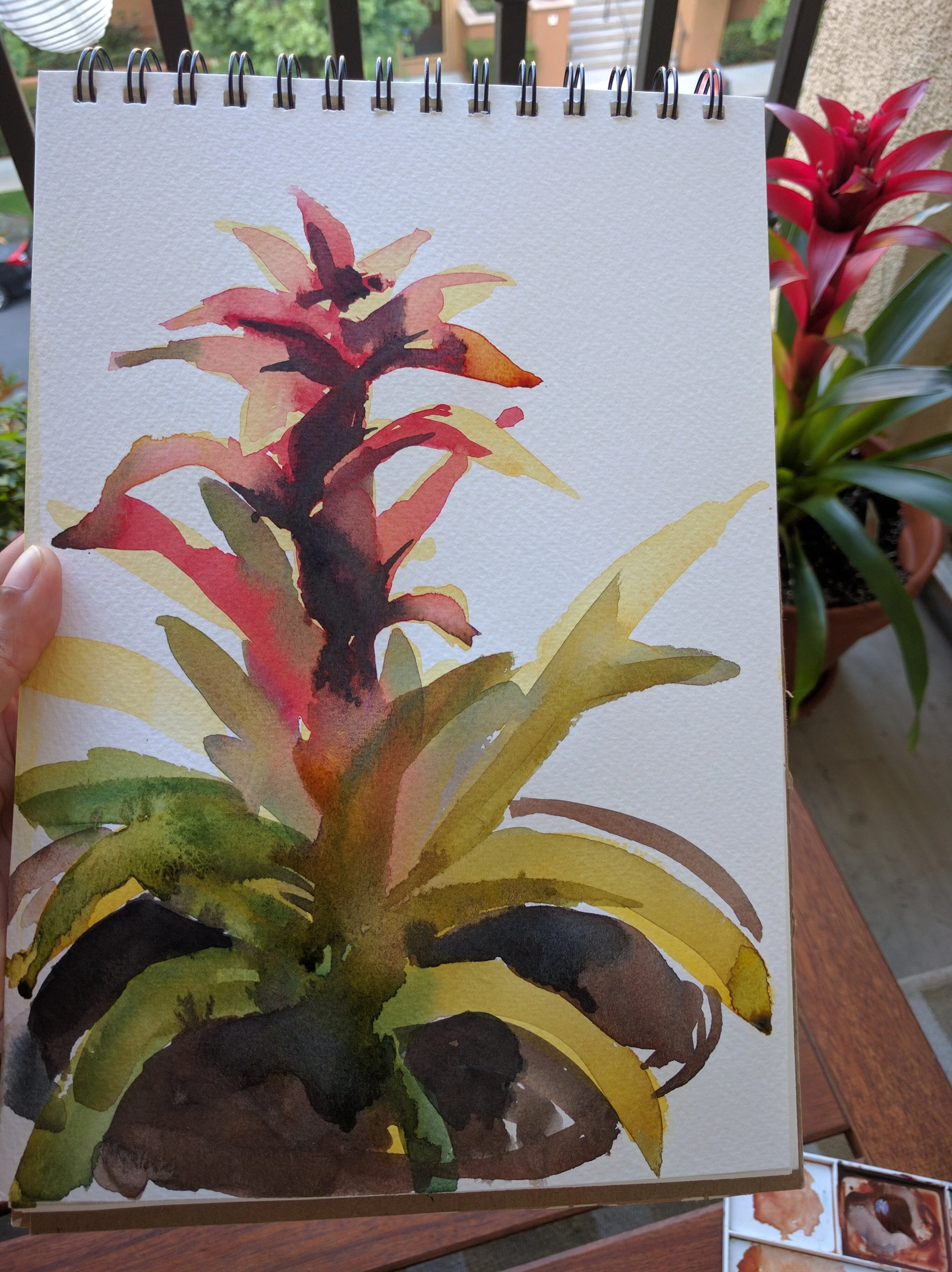
Back to florals
Srivani Narra Ward
Art
Sep
8
Sep 8
Crazy experiment
Srivani Narra Ward
Art
Sep
7
Sep 7
Floral Study 6
Srivani Narra Ward
Art
Sep
6
Sep 6
Life Drawing Tuesday
Srivani Narra Ward
Art
Sep
5
Sep 5
Floral Study 5
Srivani Narra Ward
Art
Sep
4
Sep 4
Floral Study 4
Srivani Narra Ward
Art
Sep
3
Sep 3
Floral Study 3
Srivani Narra Ward
Art
Sep
2
Sep 2
Floral Study 2
Srivani Narra Ward
Art
Aug
28
Aug 28
Floral study
Srivani Narra Ward
Art
Aug
15
Aug 15
Hard and soft edges
Srivani Narra Ward
Art
Aug
14
Aug 14
Watercolor value sketch
Srivani Narra Ward
Art
Aug
13
Aug 13
South bay urban sketchers monthly meetup
Srivani Narra Ward
Art
Aug
12
Aug 12
Heading home
Srivani Narra Ward
Art
Load More