Don Edwards National Wildlife Refuge

I took my new En Plein Air Pro Watercolor Easel out to try and I am happy to report that I really like it.

I will probably write a detailed report of it at some point but here is a quick post about the painting I did 'en plein air' at the Don Edwards National Wildlife Refuge. 

Here is a view of the marshes, looking over at the office buildings and highways in Fremont, CA.

Marshes

Marshes

I am happy to be back to painting and I have to have a new toy to try!

Floral study

August has been the month of the Discardia project in our household, there was stuff everywhere you look, the house was a mess, it was all I could do to keep my sanity through it all. As a result I have not had much inspiration to do any painting lately. It has been a couple of weeks since I did any, and I was feeling self-conscious and trepidatious about starting up again. Do you ever feel that way after a break? 

Anyway, yesterday someone posted some paintings they did of loose floral studies from Youtube tutorials and I thought that it is the best way for me to get back on the horse. Just go forth and splash some color around.

I have been meaning to make it a practice to do some quick charcoal studies before doing the color studies, and that is what I did here.

And then I picked three colors that I haven't tried before - Perylene Violet, Gold Ochre, Permanent Sap Green.

This is not great art by any means, but I am happy to be back to painting and I wanted to post my creations here in the spirit of full-disclosure :-)

Hard and soft edges

I spend a lot of time on the internet, scouring for quality art instruction, interesting blogs, inspiring paintings, art tools etc. A lot of that time is probably wasted and better spent practicing art, but sometimes I discover things that makes all that time worth it. 

Today I discovered an interview of Alvaro Castagnet in which he talks a little bit about his process. He talks about using the push and pull of warm and cool colors, dark and light values, hard and soft edges to create interest in your painting. He talks about using charcoal sketches to design the paintings, with respect to values as well as edge quality.

I never thought of edge quality as such an important element in painting, but he is totally right. I used to paint almost everything with hard edges, and it used to sort of turn into paint-by-numbers. I am happy that I am able to break out of that mold and explore painting across shapes.

In the charcoal sketch below, I explored merging the body of the chicken into the background, and leave the head of the chicken as the focus, with the highest contrast as well as hard edges. 

When I was satisfied with the sketch, I made a quick plan of the colors I was going to use, and the process I was going to use to paint. I made a first wash painting all across the paper, around the areas that I want to leave white, but otherwise covering most of the other surface with color. With my second wash I picked out some areas and added deeper color, or added contours. Then I flooded in the color for the head, and added some calligraphic marks on the tail.

I learned a lot from this 20 minute exercise :

  • Edge quality adds a lot of interest to painting.
  • Painting across shapes unifies the painting, and makes it look less like an illustration.
  • Charcoal sketch is very useful not just to explore value patterns, but also edge quality in the design.
  • My calligraphic marks are terrible and need a lot of work :-)
  • I don't have a very good sense of what value a color mixture is, and as a result the values in the painting are quite dull. I need to practice in order to train my eye for this.

This is not a great painting, I agree. But I am really proud of it because I broke some bad habits, and did some new things. Now I just need keep pressing forward. I am especially proud of the painting because it looks so little like the original (a reference from wetcanvas) !

Watercolor value sketch

As I was painting yesterday, I realized how I was thinking of the painting in terms of "here is this building, here is a tree, here is the street winding away and disappearing". I wanted to think in terms of big value shapes and design, but it was not intuitive to me. It didn't help that I only had about an hour to finish my painting. (I also wonder if the fact that I was working on a small surface (7.5x11) is a factor, because there is hardly any real estate for me to think in big shapes? I am not sure about this one because James Gurney seems to be able to do such wonderful realistic paintings on his 5.5x8 moleskine.)

Anyway, I got thinking about this some more after I returned home and picked a few books off the shelf to flip through for ideas. Funnily, my previous bookmark in Tom Hoffmann's Watercolor Painting book led me to the exact thing I needed. In order to clarify the big shapes, Tom suggests breaking the picture down into large shapes (10 or less), and doing a five value watercolor sketch to understand the value relationships in the composition. 

This is the sort of exercise I would always resist doing because I am always in a hurry to do a full painting, that is a final product that can stand on its own. I realize now, though, that to take my painting to the next level I need to step back, evaluate the areas in my painting that need work, design exercises to fix these areas and execute. 

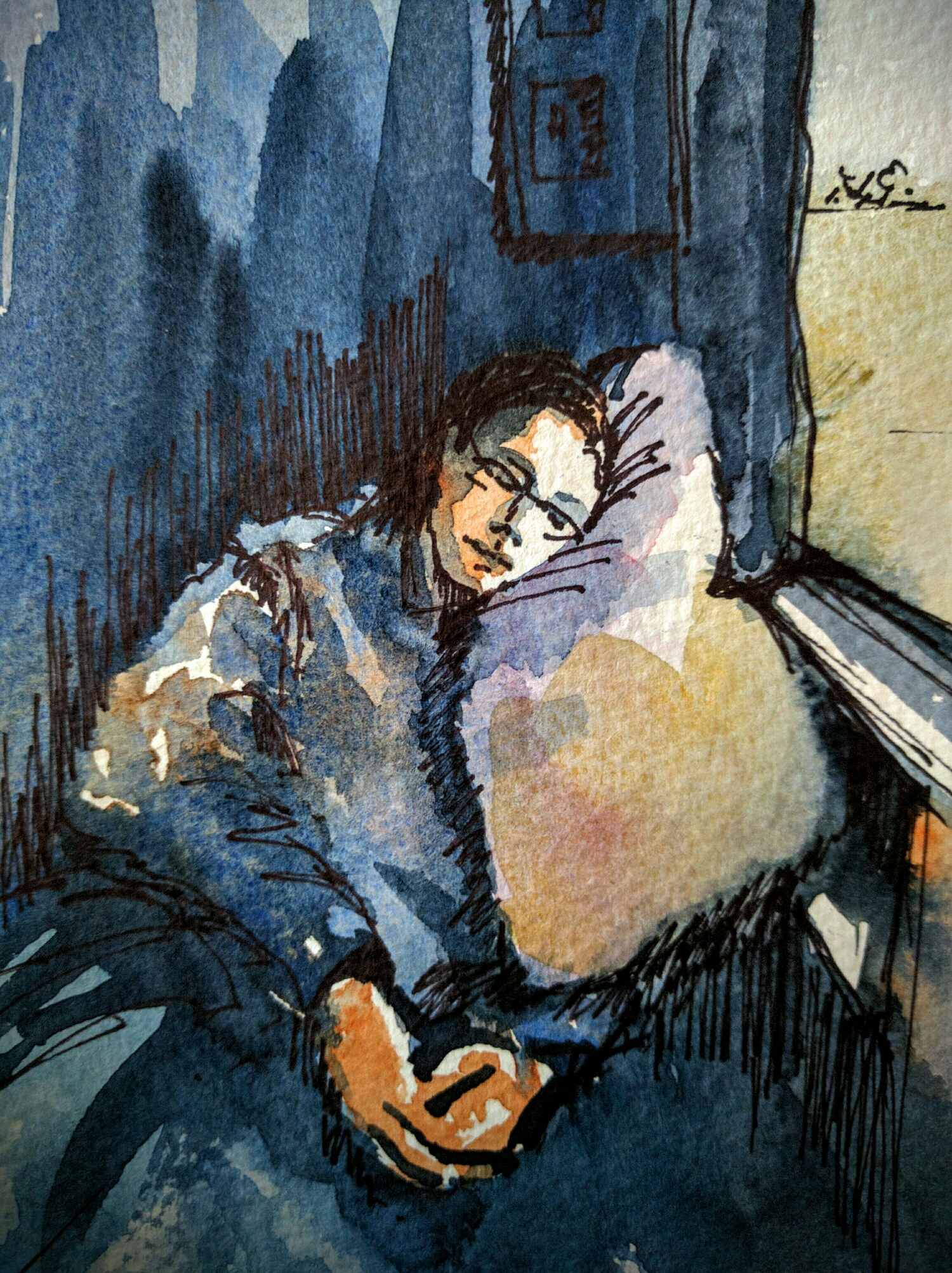
In that spirit, I did a bunch of these value exercises from some reference photos on Wet Canvas. Here is an example. I picked reference photos that already had good design in terms of shapes, so that I was only focusing on understanding the values and not worried about creating a composition.

Reference photo from Wet Canvas

I drew a very simple sketch with big shapes.

My first wash of payne's gray covered everything but the lightest lights.

Progressively I added another layer of Payne's gray to areas that are darker. Note that I added the boat on the left for interest. That area looked empty and static to me, and the boat in the reference seemed like it was useful.

And then the darkest darks. Here is the final sketch. 

Heading home

Today was a day of ups and downs. At once I was inspired and rearing to go, as well as rudely reminded of my own mediocrity and limitations.

The day began with watching Alvaro Castagnet work in some videos. I couldn't stop  watching him apply juicy colors and confident strokes and his sense of design inspired me to try it myself.

I have heard many artists say that it is always best to make a sketch as opposed to depending on a reference photo, and for the first time it sort of hit me how true that is. When you sketch, you are problem-solving, you are designing. When you take a reference photo, the camera captures everything it sees, and sometimes the subject that caught your eye is lost in the commotion. 

I have been trying to sketch from reference photos on the internet, and for the past few days I have found it so hard to be inspired by any of them. I spent countless hours scanning through pictures looking for something that might click and nothing seem to. Finally, I end up picking some random thing because I don't want the day to end without painting something. Artists also recommend to capture your own reference photos, because you have a sense of what interested you about the scene in the first place and you are less likely to be lost.

I am sure you heard all this many times over. I had too. Somehow it didn't hit me until now, the way it did today. 

When I was returning home from work, this scene of daily commute struck me. 

Specifically, I was attracted to the red car, and I thought to crop it in such a way as to make it the star.

Now it was time for me to design how I was going to paint this. I took a couple of minutes to do a quick charcoal sketch to map out the values.

Now, to turn this into watercolor I needed to plan and choose my colors. I thought I will try to keep everything fairly neutral and cool, and this way the car will shine. 

Honestly, I am not happy with how this painting turned out. I envisioned lovely loose brushstrokes and juicy marks like in Alvaro's paintings, and ended up with this. Of course I am disappointed with the painting, and with being struck down to face my own smallness. I think that is good though. It is good to remember that I am very much a beginner, and it takes a lot of work to make things look as easy as some do.

After I have had sometime to process all this, I am proud, though that I tried to do what I did, and I hope to keep up the practice. 

Olympics soccer

As I was wondering what to paint this evening I realized that there is Olympics on on TV and that might afford some interesting gestures to paint. Unfortunately it wasn't yet 7:30PM and only soccer was on, but I decided to go for it anyway. My sweet husband found me nice shots to sketch from, paused the TV at just the right moment and .... this happened :-)

soccer in watercolor

Another cloud study

I wanted to swish some paint around and paint some clouds today. I think these clouds are not as bad as the ones from a few days ago :-)

Here is a sunset sketch painted from a picture I took from the train. Most of the picture was gray except for a little sliver of red around the horizon. 

sunset in watercolor

Here is another sketch quite a bit early in the sunset, where there is that warm glow at the edges of the clouds, but the colors are still muted and cool for the most part.

And with this one, I chose a reference picture of some stormy clouds and enjoyed painting the gray sky in payne's gray. 

stormy sky in watercolor

I really like looking all three of these together. They are all paintings of sky, but they all look so very different! Still a long way to go in my sky practice, but this is a good start I would say :-)

Some monochrome sketches

I was watching some Zbukvic videos on youtube earlier today and it inspired me to try some quick sketches with interesting brush work. In order to focus on the brush work and not on colors I thought it might be best to work in one color. 

Here are a few :

I added a few dabs of burnt sienna for interest :-)

Marsh sketches

California weather is almost always beautiful, and it was especially lovely today. It was about perfect for an outing to the marsh to sketch the landscape and observe the birds at the bird refuge. It had also been a few weeks since Iva and I got a chance to sketch together, it was so nice to be able to enjoy the landscape with some lovely conversation with a good friend. What's better!

I am not very comfortable with painting landscapes. I don't get a chance to do it enough, and it is not the subject that I am usually interested in. The recent train ride across the country got me excited about trying out landscapes and here I am :-)

I couldn't help wanting to do a quick sketch of Iva. I am much more comfortable and enjoy myself so much more when I am sketching people. The sketch is not at all good likeness to my beautiful friend, but it captures the essence of the sketcher I think :-)

Train sketch

You will likely see a whole bunch of sketches here for the next few days with a travel theme. Yes, I do have a lot to share from my trip.

Here is one from the train. I painted the scene directly in Watercolor, and when I noticed that the painting wasn't drying as fast as I would like in order to add definition, I decided to add the definition with a sharpie. 

train nap in watercolor

train nap in watercolor

I like that the picture reads clearly even know there is not a whole lot of detail. I am quite proud of this. 

Hang tight for more travel sketches in the coming days.

Cloud study

We had been traveling the past week, and traveling is always such a wonderful opportunity to capture exciting new sights and scenes. Don't you think that when you are traveling, even the mundane looks exciting? For example, clouds!

Here in the bay area we don't usually get big large clouds. In fact I realized only recently, living in an urban area, we don't usually look up at the sky much. Traveling across the country in the train, I got to see clouds with new eyes, how different they look in different parts of the country, how they look different at different times of the day, how they can be used in exciting ways to compose a landscape painting.

I would love to learn more about painting clouds, beyond the usual ultramarine blue and dad out a few wisps of clouds with a kitchen towel. 

Here are a couple of studies done from the view out of our Amtrak window, somewhere in Utah.

clouds in watercolor

There are parts of the above sketch that I liked, but there was a lot that I didn't. I used it as a learning opportunity to make notes of what needs to be worked on. I used a different approach in the next sketch, and focussed on achieving painterly effects as opposed to accuracy. 

clouds in watercolor

I learned a lot from the cloud study actually.

  • Clouds can be used to add much drama to a composition of a landscape. 
  • There is a lot of interesting perspective involved in drawing and painting clouds accurately. 
  • Clouds look different depending on how they are lit. Paying attention to the shapes and shadows in clouds can add to the drama. 

I will have a lot of opportunity to practice this subject because I have taken a number of photographs from the train window. I am very excited about this new discovery.

World Watercolor Month #20

This past week I have been watching Charles Reid Flower painting video, and have been inspired to try some floral arrangements. One thing he said resonated with me. He said that he doesn't paint flowers because he is passionate about flowers, or knows the different flower varieties ... he enjoys painting flowers because it gives him an opportunity to work with shapes and color.

That is precisely what I enjoyed about today's painting.

Fresh sketchbooks

I like to work in sketchbooks, rather than loose sheets of paper. I like the sense of continuity that sketchbooks give. I only have to flip through the couple of dozen of sketchbooks I filled over the past couple of years to see my artistic journey. I know that there will come a time when working exclusively in sketchbooks might no longer be an option, but until then I am going to continue to enjoy this.

There are many kinds of sketchbooks available in the market, and goodness knows I have tried many of them, but for working in watercolor, I like to use the paper that I enjoy, and not be restricted by the type of sketchbook available to me in affordable prices. My preferred paper is Arches cold press, but I am also enjoying this beautiful stack of Bockingford paper I got as a present. It is usually the case that there are no sketchbooks available in these papers, or if they are, they are prohibitively expensive. I don't like that feeling of preciousness when it comes to art supplies. 

Keeping all of this in mind, the Zutter binder is the best investment I made over a year ago. Since then I made a number of sketchbooks and I enjoyed working in them. It takes a little bit of effort to make the sketchbook, but once it is done it is yours to enjoy for a few weeks before it is time to make another sketchbook. 

I have a trip coming up and I wanted to have enough paper on hand for my sketching/painting needs, so I spent an hour last night making two new sketchbooks in 7.5"x11" format. 

Don't they look pretty?