World Watercolor Month #19

I have been hungrily devouring watercolor workshop videos by Hazel Soan on artclick.tv (I got the subscription exclusively to be able to watch her videos, and I am happy to report that it was totally worth it!), and have been so very inspired her brushwork and enthusiasm for fresh, transparent watercolors. 

In her 10-minute watercolors video, she does a portrait in 10 minutes (!!) and it looks so fresh and spontaneous. I have been trying a lot of Hazel Soan exercises lately, so I figured, what the hell, I will try this one too.

I did this exercise from a photo (shared on pmp-art.com), directly in watercolor using ivory black as my only pigment. I just carved the shapes out with my brush, moving between areas and waiting for the damp areas to dry just enough to take the next layer of pigment etc. This was completed from start to finish in 20mins. It is not quite Hazel's 10, but close!

I haven't been practicing portraits really, but it looks like practicing good brushwork, painting in shapes etc. has translated into better portraits.

Things I learned :

  • Yes, what they say is right. It is all just shapes - large, small, tiny, but all shapes nevertheless.
  • Ivory black on watercolor paper affords more control and smoother transitions than using black ink or water-soluble graphite, as I have done in the past. Both of these latter ones used to leave ugly streaks all over, and I realize now that it is the property of the media.

World Watercolor Month #18

I picked a floral subject for today's exercise because I think they are the perfect subject for practicing design, simplifying complexity into simple shapes, trying out many many lovely colors.

This painting is inspired from an exercise from Watercolor Simplified. I used a number of transparent pigments for this painting - quin gold, phthalo blue, quin rose. I may have dipped into a bit of indigo and phthalo green for some of the darks.

Things I learned from this painting :

  • Design is more important than realism. Think in large shapes, and just enough detail to suggest the subject. 
  • Shadows don't have to always be purple. Here the yellow orange shadow works beautifully.
  • Use the right size brush to cover the area, otherwise you will need to make too many brush strokes to join up an area with color and this can make things look busy and untidy.
  • Practice brush strokes to make the leaves look more lively.

World Watercolor Month #17

For today's exercise I wanted to spend some time working in large shapes, and exploring some new colors, new color triads and see what I discover.

I was browsing through Watercolor Simplified by Pat Weaver, and this value study exercise seemed like a good candidate for what I want to do today.

For this first value study I used W&N Ivory black. I quite liked how the paint moved when dropped into a wet wash. I have a few other different blacks on hand and I look forward to trying them all for more value studies. I learned from this study that doing value studies is a great way to practice composition and brush work.

watercolor value study

I them moved on to a palette listed in the book - Opera, Aureolin, Cobalt Blue. The tubes that I own are Holbein, and I didn't realize that Holbein's Opera and Aureolin are not transparent. The mixes were very heavy, and the color wouldn't move or glaze the way I like watercolor to. 

For the next study I decided to try a more muted and transparent palette, so I swapped the cobalt blue with prussian blue and the opera with perylene maroon. I retained the aureolin (which probably was a mistake since it is opaque).

I love how transparent watercolor shines, and I am much happier with this last study. I think this can be further improved by replacing the opaque yellow with a transparent one. 

Opaque colors have their place, but it is definitely not in creating brilliant washes. 

Things I learned today :

  • It is a fruitful exercise to figure out which of the hues I own are transparent and which are not. Same hues by different manufactures have different properties.
  • Use transparent colors.
  • Value studies are a great way to simplify the design, practice composition and also brushwork.
  • Doing multiple studies of the same subject is a great idea!

I would call that a good day of learning.

World Watercolor Month #16

This is a little sketch of my view from the pokestop in our neighborhood. I did a very loose pencil outline of the cars and the trees, and started off with my brush. It was a warm, arid morning so there was not that much time to work wet-in-wet. However, this meant that I could work in layers, so that is what I did. I am happy with the strong light and shadow on the car and the ground.

Also, I collected around 20 pokeballs! Win!

World Watercolor Month #14

Peaches two-ways, for today's entry.

I picked a nice looking picture of peaches on tree, and got to work. One of my goals this month has been to experiment with new hues, and that is what I did today. 

For this first one I picked two new hues that I have never used before - Prussian Blue and Quin Red. I wanted to use Indian Yellow, but I didn't have it on hand. I went with Azo yellow instead. 

Peaches in watercolor

While I don't hate it, I felt like this picture lacked good design. I like the central peach well enough but the leaves lack life, and the tonal composition of this whole painting needs more attention. 

Peaches in watercolor

For the next one I wanted to keep the design simple, try not recreate the picture as I see it but painting what would look interesting. The effect is entirely different, and I am kinda proud of stepping out of my comfort zone. 

This one is painted with Azo yellow, Prussian blue and Pyrrol red.

World Watercolor Month #11

A simple study of onions for today's watercolor practice. I used three colors - Azo yellow, Alizarin Crimson, Ultramarine blue - for this study. 

Two things I learned is that 1) back side of Bockingford paper is not as absorbant or as responsive as the front side. 2) The arid, dry air in California makes drying times much shorter than I have experienced in Alabama for the past week. This makes working wet-in-wet challenging.

If you ask me honestly, I will say that I don't care for this painting. However, a while ago I resolved to not be disappointed in my art, because that is not productive. It is a lot more productive to pick out and appreciate the good parts, and learn from the bad. 

One thing I like about this painting is that it has good tonal composition. When I look at the painting from a distance it reads clearly, and that is a good thing. One thing that I would improve next time is to not use such saturated color all over. The painting looks busy and there is no relief to the eye.

World Watercolor Month #10

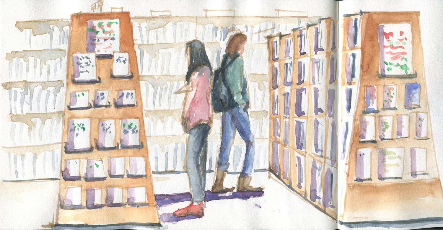
After a long time I had the opportunity to sketch with Iva. It was a lovely day for it too, and we all spent the afternoon chatting and sketching at Santana Row. 

Here is a sketch of the men planning an epic trip :-)

Thanks to Hazel Soan's books, I am beginning to focus more on making expressive marks with the brush and not so much on drawing contours and filling in color. I am happy with the results I got today. 

World Watercolor Month #9

I really admire Hazel Soan's style and technique, and I have learned a lot from her books just in the past week. Here is another exercise from her book, The Essence of Watercolor.

The purpose of this exercise is to make expressive brushstrokes and make each brushstroke count. Mine doesn't look as fresh as hers, but I quite like how the elephant came out.

World Watercolor Month #4

Today was a super busy day but got one done anyway. This is another exercise from the Hazel Sloane's book I discovered on Amazon. 

Doing these quick exercises is giving me an opportunity to introduce new colors into my studies. Today I used Indigo, Cadmium Orange and some Cadmium Red. Crazy! 

Photographed at night in yellow light. Ugh.

World Watercolor Month #3

Some super quick flower paintings for today's practice, all done from Hazel's Sloan's book. It gave me an opportunity to use some colors that don't usually use, like transparent violet, azo yellow, sap green.

upload.jpg

I used cobalt violet, sap green and some azo yellow for the above bellflower. I did a contour wash of the entire flower, let it dry and went in with darker cobalt violet wet in dry for the shadow areas. I added some brown to the sap green to make the darker and duller green for parts of the leaves and the stems.

I used alizarin crimson for the bell flowers, and transparent violet and burnt sienna mixture for the branch. At the end I dropped in a bit of that dark mixture into the dark areas of the bell flower for further definition.

upload.jpg

The daisy was done in cadmium red, azo yellow and viridian. It took all of 3 minutes to do this one. 

World Watercolor Month #2

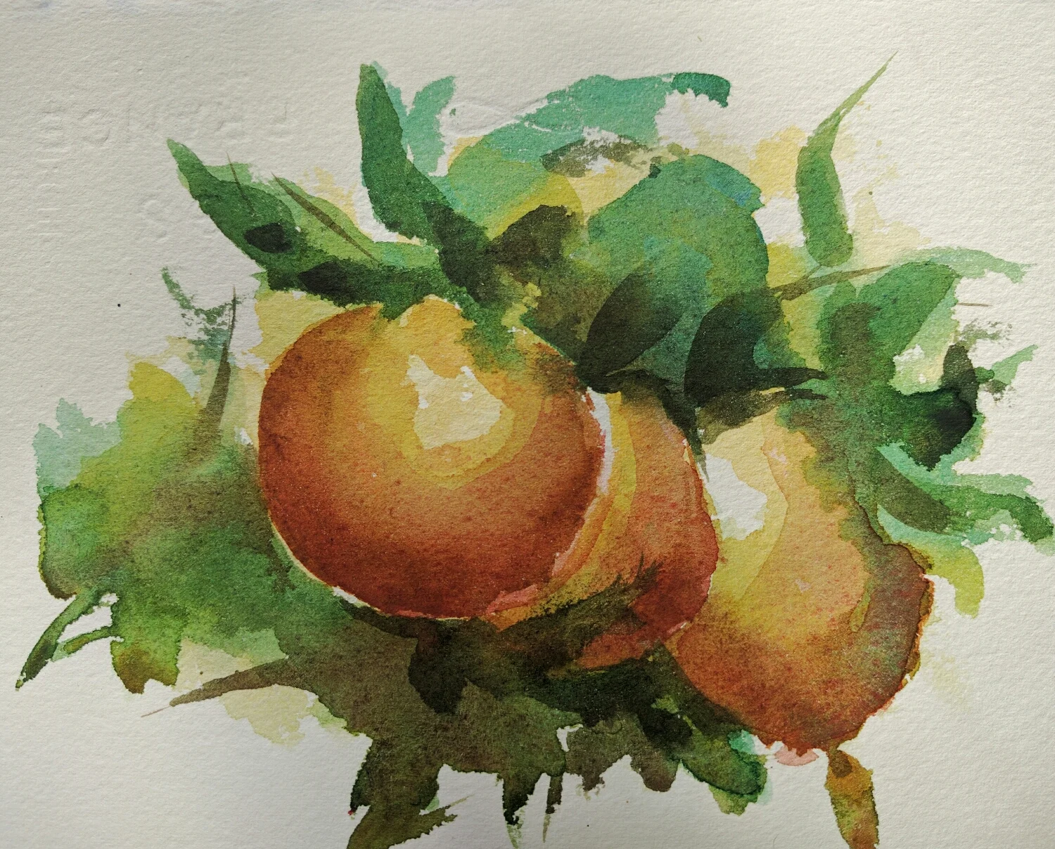
A quick 10 min painting of some oranges on the tree. Doing a whole bunch of small paintings is ever so much more instructive than doing a large painting. This way you have a change to iterate and correct your mistakes. 

upload.jpg
I was unable to get real bright orange color, and I realized that the reason was that my brush wasn't cleaned fully after I handled pthalo blue for the leaves. This was causing the orange color to get dulled down. 

World Watercolor Month #1

This month is going to be all about practicing and honing my watercolor skills. It is wonderful to have the company and support of hundreds of fellow artists all working on this challenge together.

I did a little exercise from Hazel Sloan's book I downloaded on kindle. She knows her stuff and is a wonderful teacher. Her quick watercolor sketches are easy to follow. Here is one of people in silhouette.

Earth tone artgraf and more life drawing

Encouraged by the success we have been having with the artgraf watercolor graphite, we bought a set of earthtone graphite by artgraf. It arrived today and I tried it out in today's life drawing. Here are a couple.

I am proud of this first one because I started with gesture lines as opposed to my obsession with getting the contours in. I think this pose captured the original gesture quite well.

life drawing in earth tone artgraf watercolor graphite

You can see the color swatches of the earth tone artgraf on the right. The colors are quite suitable for figure drawing. The main trouble I had was using a small brush. The graphite doesn't like being mushed around unlike watercolor, so the right size brush is important. I could have lived without all the streaks in this picture.

life drawing in earth tone artgraf watercolor graphite

The next one is just regular graphite. I quite liked the gesture in this one too. I think I am getting somewhere capturing the human body.

More artgraf practice

Husband and I are continuing to do figure drawing together, and here is one of mine from today.

One thing I am noticing in  my sketches is that my quick drawings of faces has become more convincing than before. All of that head drawing practice must be paying off. I still not get any good likeness, but that's beside the point as these are supposed to be gesture sketches not portraits.

Most days I am so tired by the end of the day from work and chores that I find myself not having the mental bandwidth to think of anything elaborate to work on. I like to keep a regular art habit though, and figure drawing seems to work out best. There isn't a whole lot of decision making on what to draw or paint (hubby chooses one or two pictures for us to work on), and keeping the tools simple (pencil and artgraf, or monochrome watercolor) makes it simple to setup and tear down. 

The other advantage of doing these simple figure drawings is that it affords me an opportunity to think of ways to compose an interesting picture by manipulating the value patterns, while keeping most of the other parameters constant. 

Minimal gesture sketch

During figure drawing yesterday I wanted to try something slightly different. I wanted to see how little I can draw and still convey the gesture. I tend to do a full contour drawing when I use a graphite pencil, so I thought I will try this exercise with watercolor.

What do you think? Can you see the gesture? 

watercolor gesture sketch